Safeguard Medical
Safeguard Medical needed to unify seven healthcare brands under a credible, scalable digital experience while fixing fundamental UX and technical issues.
I led the UX strategy to align platform, audience architecture, and UX/UI experience priorities to support both professional and future DTC growth.
Role: UX Strategy Lead
Scope: Website redesign, Platform Migration
Understanding the Landscape
Safeguard Medical is a unified global alliance of category-leading emergency medical brands, brought together to empower people to save lives, whether they are seasoned first responders or everyday individuals preparing for the unexpected.
The existing website struggled to support that mission. It suffered from frequent technical issues, a clunky CMS, and broken add-to-cart flows. More critically, it failed to clearly communicate who Safeguard was as a parent brand or how its portfolio of products worked together.
Early conversations and audits revealed a consistent pattern: users often recognized individual sub-brands, but lacked clarity on Safeguard Medical itself, creating friction for both discovery and conversion.
Vision & Alignment Pre-Amble of Why this is Important
Vision
Why this works:
Stability and scalability come first
A reliable platform and modern CMS were non-negotiable. Without a stable technical foundation, neither professional workflows nor future consumer experiences could be supported sustainably.
Professional audiences remain the core
While the shift toward consumer audiences motivated the redesign, first responders and B2B partners continue to drive Safeguard’s business. The experience needed to evolve without disrupting the audiences who already rely on it.
“Creating space” is an architectural decision
Consumer growth does not require consumer content on day one. Instead, the site structure, navigation, and page hierarchy were designed to anticipate future audiences—so new content and products can be introduced without rethinking the system.
Create a stable, scalable digital foundation that supports today’s professional audiences while intentionally creating space for future consumer growth.
Alignment
This ensured the work consistently prioritized:
Platform reliability over cosmetic redesign
Fixing broken UX flows over adding net-new features
Brand clarity over sub-brand sprawl
Scalability and enablement over one-off solutions
These priorities became the filter for every design, content, and technical decision.
With alignment in place, website priorities were explicitly established to guide decision-making and resolve tradeoffs throughout the project.
Audience Segmentation & Definition
Safeguard Medical serves a wide range of audiences with different levels of expertise, urgency, and intent. Early alignment focused on clearly defining who the site serves and what each group is trying to accomplish, so structure and content could support real use cases without fragmenting the experience.
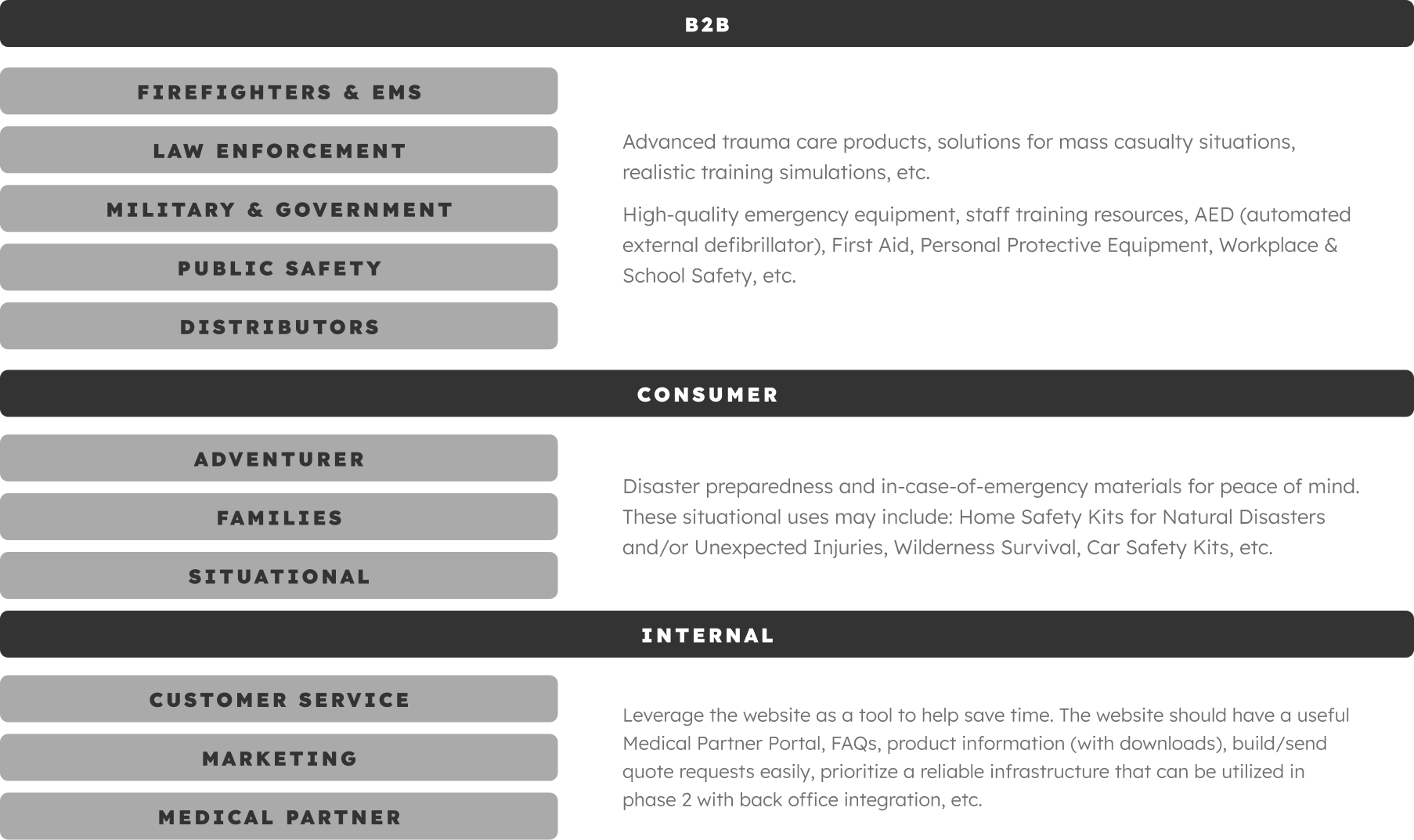
Primary Audience
First Responder Government Entities or Retailers, including:
Firefighters & EMS
Law Enforcement
Military & Government
Public Safety Organizations
Secondary Audience
This group includes families, adventurers, and situational users preparing for emergencies related to home safety, travel, wilderness survival, or natural disasters. Consumers are typically unfamiliar with Safeguard and may feel intimidated by emergency medical equipment.
Tertiary Audience
Internal Safeguard Team including: Customer Service, Marketing, and Medical Partners rely on the website as an operational tool, not just a marketing surface.
These audiences are often existing customers or procurement-driven buyers. They prioritize speed, accuracy, and confidence in product selection, along with access to technical documentation, training resources, and clear paths to purchase or request quotes. The experience needed to support high-stakes decision-making while reinforcing trust in Safeguard’s expertise and product quality.
For this audience, the experience needed to lower barriers to entry through education, clarity, and reassurance, without diluting credibility for professional users or prematurely over-indexing on consumer content.
For these teams, the site needed to reduce inbound questions by clearly addressing common product, usage, and compatibility concerns, while also serving as a reliable source of truth for product information, downloads, and educational resources. It was equally important that the experience support sales conversations through clear product organization, intuitive quoting paths, and shareable links, all while enabling faster updates and easier content management through a stable, intuitive CMS.
Audience Needs Mapped to Core Website Tasks and Content Priorities
Audience Name
Primary:
Secondary:
Content:
Audience Name
Primary:
Secondary:
Content:
Audience Name
Primary:
Secondary:
Content:
User Goals & Information Architecture
The information architecture was shaped around core user tasks, including:
Discovering and purchasing trusted products
Understanding how Safeguard’s brands relate to one another
Requesting quotes or accessing supporting resources quickly
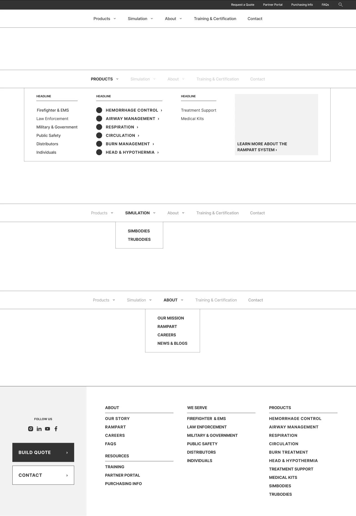
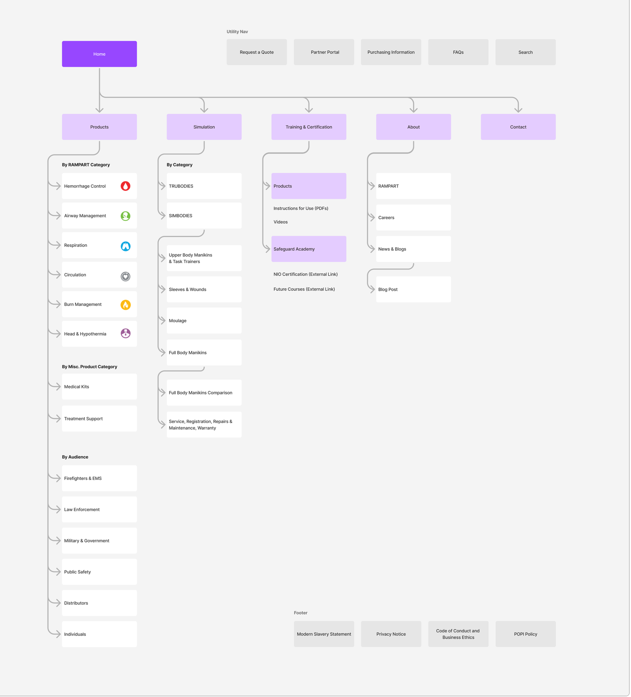
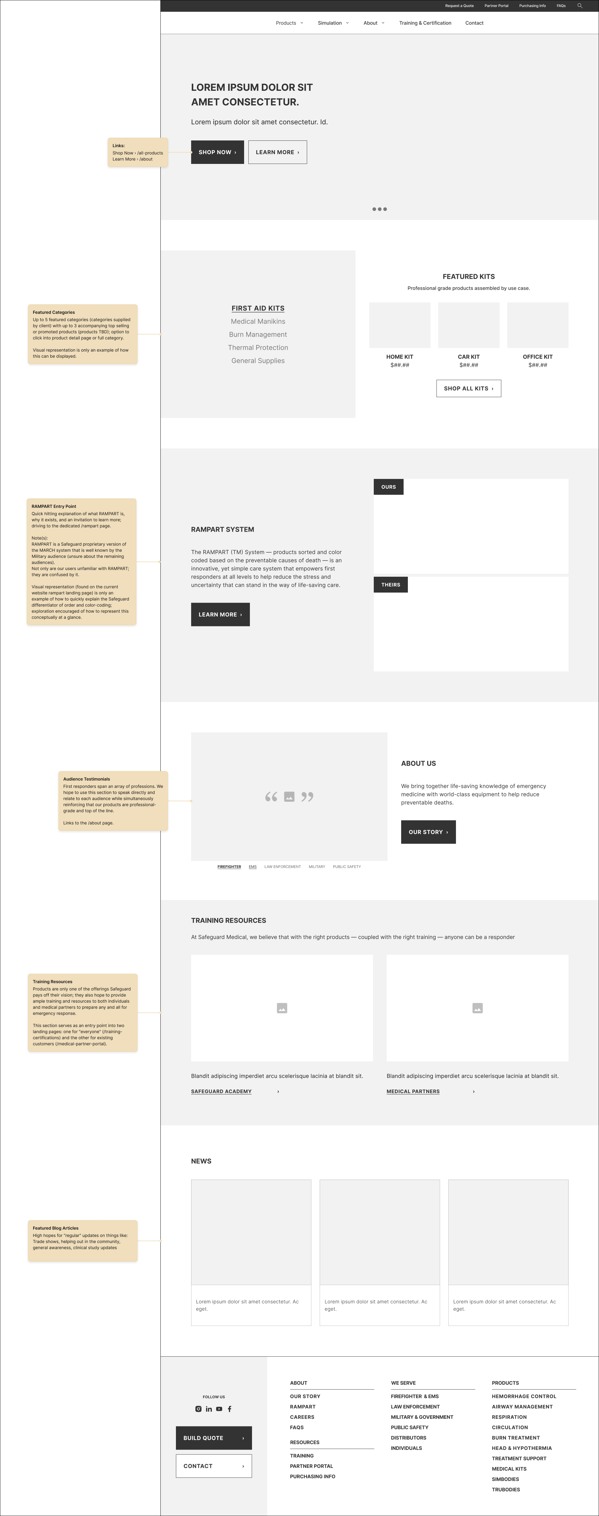
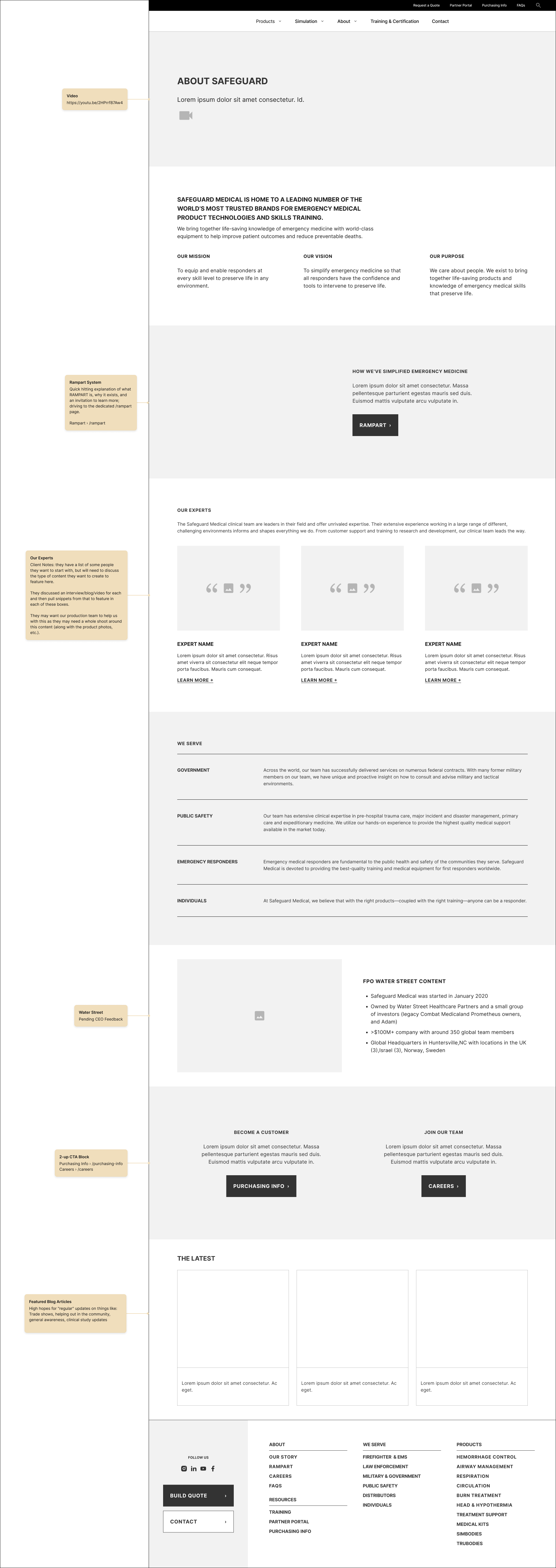
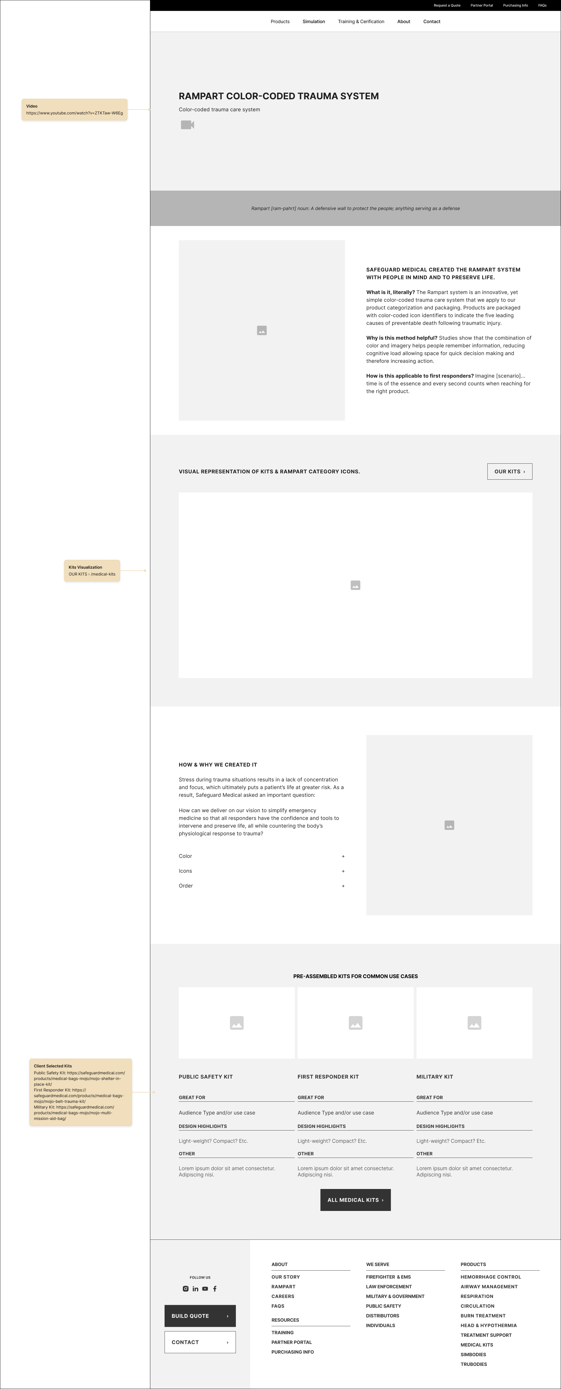
Wireframing & Annotated Requirements